Create a custom CSS drum animation
Overview
In this tutorial, we'll create a custom CSS drum animation, like the one on the homepage of this site, using HTML & CSS I would recommend using CodePen to follow along with this tutorial.
Prerequisites
- Basic HTML knowledge
- Basic CSS knowledge
- Willingness to learn
- A computer with internet access
Step 1: Create the HTML
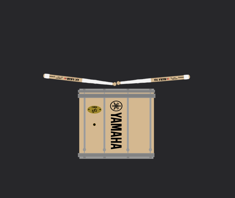
You're going to need to create assets for the drum animation. I do graphic design and just spent a couple hours in Inkscape creating the assets as SVGs. You can use whatever tools you want to create the assets, but I would recommend using SVGs as they are lightweight and play well with CSS. You can also use more HTML & CSS to create them.
Anyway, you will need to create an html structure like the following:
You should have something that looks like this:
Step 2: Create the CSS
Now that we have the HTML to work with, let's talk about what we want to make this look like.
Our goal is to make a CSS animation to make the drum apear to play itself.
Let's create a CSS file along with our HTML and put some basic styles in it.
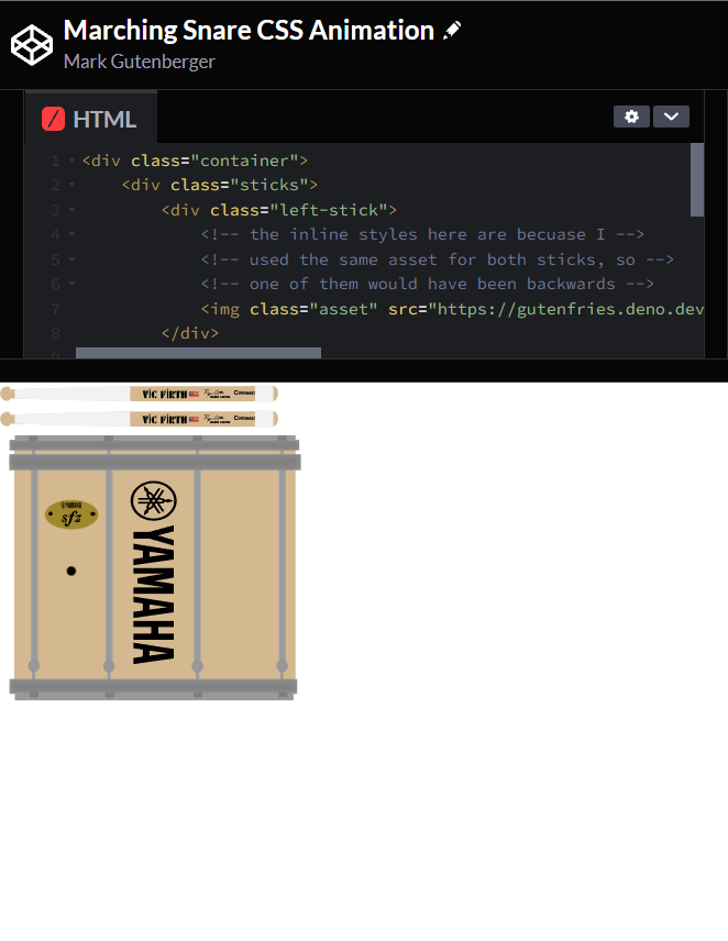
At this point you should have something that looks similar to this:
Step 3: Create the animation
Now let's talk a little about how we want to animate this.
On a more basic level, we want to animate the sticks to rotate and 'hit' the drum a certain intervals.
to accomplish this, let's create some basic @keyframes animations.
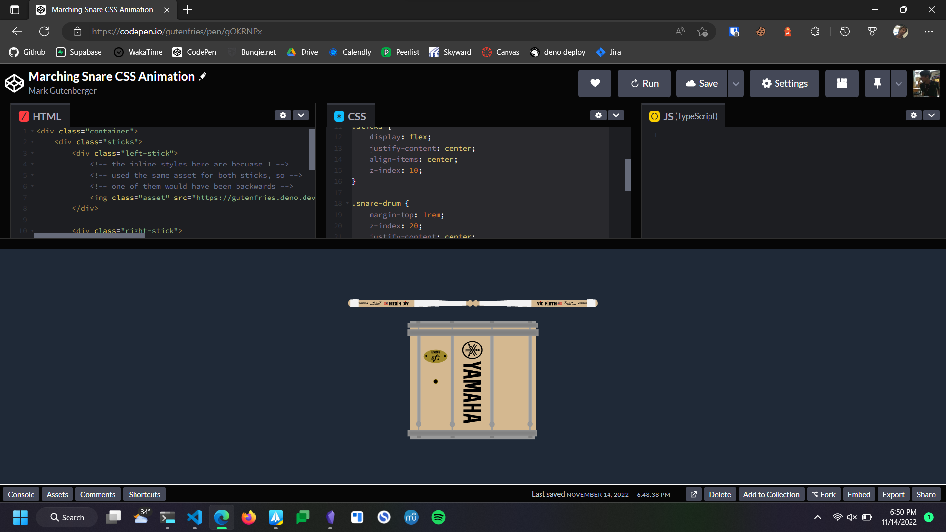
Now we have the sticks rotating, but they are just sort of floating through the drum. In order to make them appear to hit the drum, we can use some trial & error to find good degree values for the to rotate.
Now we have something that looks like this:
Step 4: Stick heights
To create some visual interest, let's establish some 'stick heights' for the for the sticks to go up and down from.
| height | deg (RH) | deg (LH) |
|---|---|---|
| parallel to drum | 0deg | 0deg |
| resting | -5deg | 5deg |
| tap | -15deg | 15deg |
| mid | -30deg | 30deg |
| full | -85deg | 85deg |
since we will be using these values often, let's create some variables for them.
However, we need the values to be different for the left and right sticks, so let's create some more variables.
Now we can replace the values in our @keyframes with the variables.
Now we have replicable values that we can use to create a more interesting animation.
Step 5: Music & Math
Let's talk a little about how we are going to go about taking the basic up down motion and turning that into 'music' animation.
First let's establish what we are going to be playing.
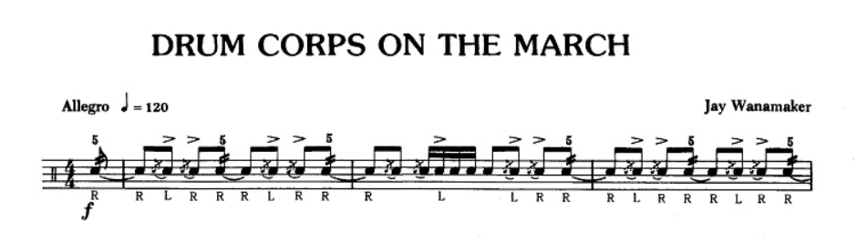
In this example, let's use the opening line of the piece Drum Corps On The March by Jay Wanamaker.
The 4/4 makes our life a lot easier in this case, since 4 is a clean number to work with.
In one CSS @keyframes animation, we can have 100 frames, from 0% to 100%, that we can use to animate the sticks.
One frame counts for a single motion, so a minimum of two frames are required to make a single 'hit' of the drum.
The smallest note value in our piece is a 32nd note (16th note diddle), so we can say that two frames is equal to one 32nd note.
Let's put this in a box.
Two @keyframes = One 32nd Note |
|---|
Using math, we can figure out how many @keyframes each other note value is worth.
| Note Value | # of @keyframes |
|---|---|
| 64th | 1 |
| 32nd | 2 |
| 16th | 4 |
| 8th | 8 |
| quarter | 16 |
| half | 32 |
| whole | 64 |
Now we can begin to write @keyframes with music value.
You will notice that this code works, but everything is super fast, so let's figure out how to make it play at 120bpm (the tempo of our piece).
120bpm means that there are 120 beats (quarter notes in 4/4) in one minute.
we can re-write this as 120 beats in 60 seconds.
120/60We know we have 100 animation frames, each worth one 64th note (or 1/16th of a quarter note), and now we can create an equasion.
120/6 = (100 /16)/xWe can solve this equasion and find that in order for 100 frames to play at the same speed as 120bpm, our animation needs to take 3.125 seconds. Let's set this.
Now we can continue animating with all of this information.
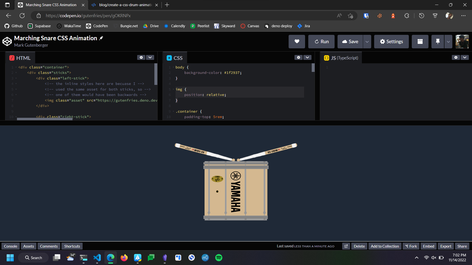
there is a live demo with source code available at https://codepen.io/gutenfries/pen/gOKRNPx